January 13, 2011 § Leave a comment
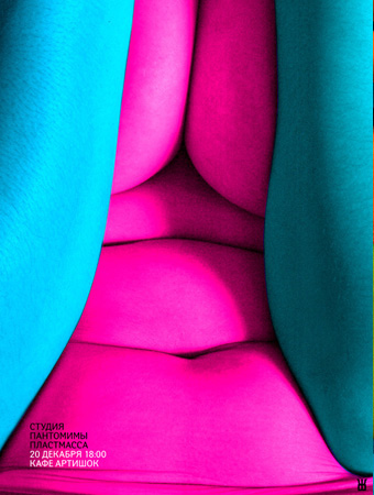
I constantly look back at these posters with awe. What an amazing combo of clever color pop and body abstraction. From Russian graphic designer Zhishi.

Also from their portfolio: this poster with some flying boobs. Does anyone know Russian? Deciphering the message here is definitely a priority.

Gallery home
September 4, 2010 § Leave a comment
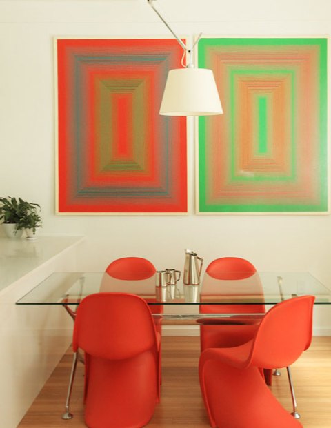
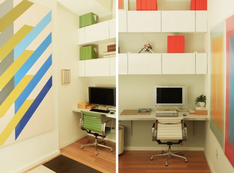
Boy did I pick the right day to go glance over at the Apartment Therapy blog.
I think I have found an interior decoration style that nearly epitomizes my design preferences. I didn’t think I would ever be drawn to mostly white spaces, but with its careful placement of color and effective use of Bauhaus art, I just can’t resist.
There is one drawback: not enough imperfection.
Bank Note Proposal
August 24, 2010 § Leave a comment
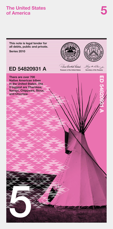
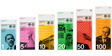
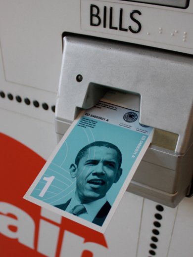
I came across these images yesterday and was intrigued to find out more about the project. Design office Dowling Duncan create a set of bank notes for the Dollar ReDesign Project by designer Richard Smith.
I think it would be amazing to see a nation with a modern look to its currency. I love this design, but…I just don’t think Obama is worthy of the $1 over Washington.
In their own words:
Why the size?
We have kept the width the same as the existing dollars. However we have changed the size of the note so that the one dollar is shorter and the 100 dollar is the longest. When stacked on top of each other it is easy to see how much money you have. It also makes it easier for the visually impaired to distinguish between notes.
Why a vertical format?
When we researched how notes are used we realized people tend to handle and deal with money vertically rather than horizontally. You tend to hold a wallet or purse vertically when searching for notes. The majority of people hand over notes vertically when making purchases. All machines accept notes vertically. Therefore a vertical note makes more sense.
Why different colors?
It’s one of the strongest ways graphically to distinguish one note from another.
Why these designs?
We wanted a concept behind the imagery so that the image directly relates to the value of each note. We also wanted the notes to be educational, not only for those living in America but visitors as well. Each note uses a black and white image depicting a particular aspect of American history and culture. They are then overprinted with informational graphics or a pattern relating to that particular image.
$1 – The first African American president
$5 – The five biggest native American tribes
$10 – The bill of rights, the first 10 amendments to the US Constitution
$20 – 20th Century America
$50 – The 50 States of America
$100 – The first 100 days of President Franklin Roosevelt. During this time he led the congress to pass more important legislations than most presidents pass in their entire term. This helped fight the economic crises at the time of the great depression. Ever since, every new president has been judged on how well they have done during the first 100 days of their term.
Frida’s Colors
July 13, 2010 § 2 Comments
Exactly one week ago (July 6th), it was Frida Kahlo’s 103rd birthday.
I also happened to watch this movie again last week. It is one of my favorites and, as with most of my favorite movies, I try not to watch it too often so there will still be surprises for the next time.
Julie Taymor and Salma Hayek did an amazing job bringing Frida’s work to life (literally). My favorite scenes include original artworks transforming into scenes. Vibrant, honest, and passionate are all adjectives that come to mind when I think of Frida’s art and the film’s story provides the context.
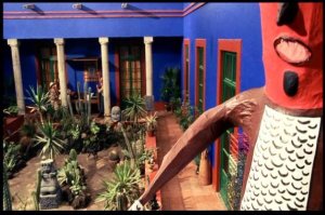
A few images to entice you:
